

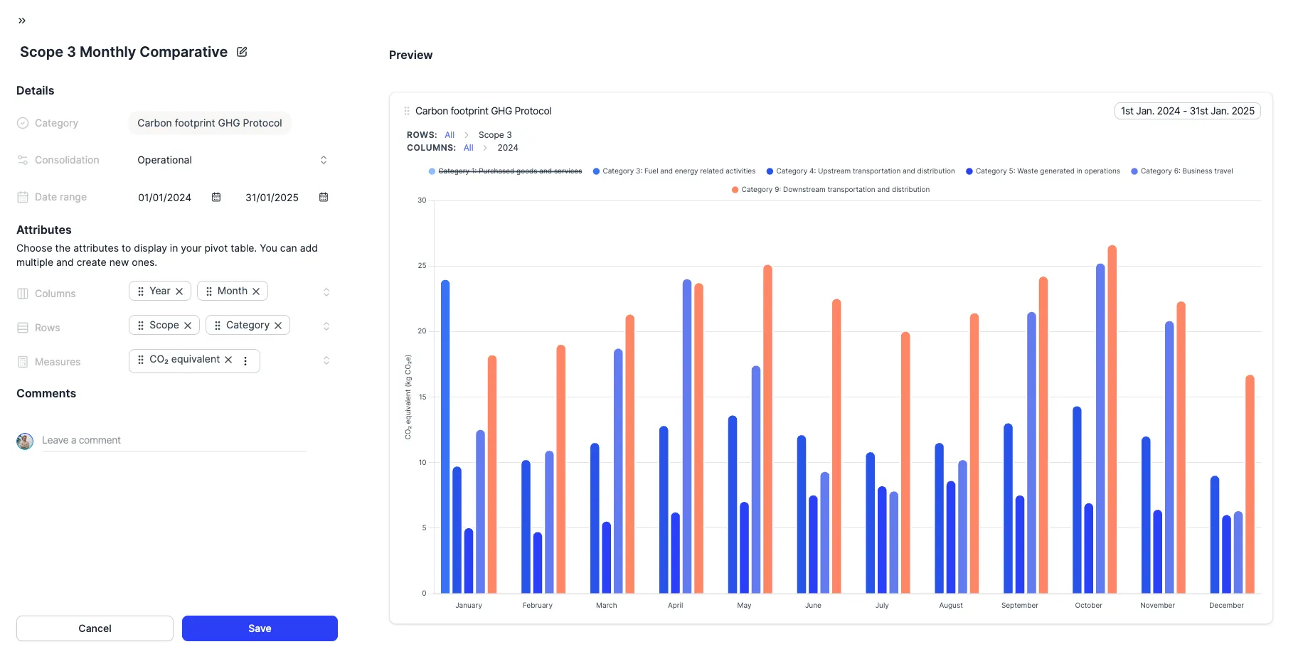
Pivot tables are a fundamental tool for exploring aggregated data in your visualizations. But some questions are better answered visually: which category accounts for the most emissions? What proportion does each site represent of the total? For those decisions, sometimes a chart is all you need.
From now on, any pivot table can be transformed into a bar chart or pie chart with a single click. No need to create anything new or reconfigure: your data, filters and attributes stay intact. Only the way you see them changes. Visualize with bars which category stands out or where deviations occur. With a pie chart, understand the real weight of each part over the total. What used to require scanning rows and columns can now be answered at a glance.
But seeing is not enough. The most powerful part is being able to explore directly from the chart. Click on any element to drill through row and column attributes on both axes. Tooltips show you the exact values and breadcrumbs let you navigate back to any previous level. All the exploration you used to do in the table, you can now do visually.
And with that clarity, decide faster. Share visualizations your team understands instantly, spot deviations without searching through cells and reach conclusions with more confidence. Your configuration is always safe: the view mode is saved automatically and if you want to go back to the table, one click and everything stays as it was. Available to all users with access to visualizations.